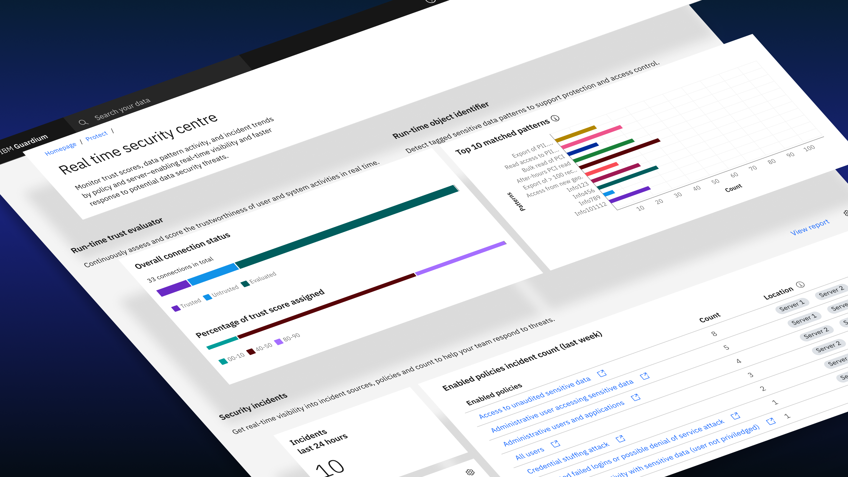
Monitoring, assessing, and responding to security threats in real time
The Real-Time Security Dashboard redesign for IBM Guardium Data Protection began with a critical insight:
Telemetry showed the dashboard was underutilized by 92% compared to other areas of the product and user research revealed that many customers didn't even know it existed.
Originally built by developers, the dashboard surfaced technical metrics but failed to deliver meaningful insight. It lacked discoverability, exposed confusing ML data, and didn't provide the clarity security teams needed to assess posture or take action.
This wasn't a visual refresh.
It was a strategic transformation focused on:
The result: a simplified, high-impact dashboard that shows less and enables far more.
The previous dashboard failed in four critical ways:
Many users didn't know it existed.
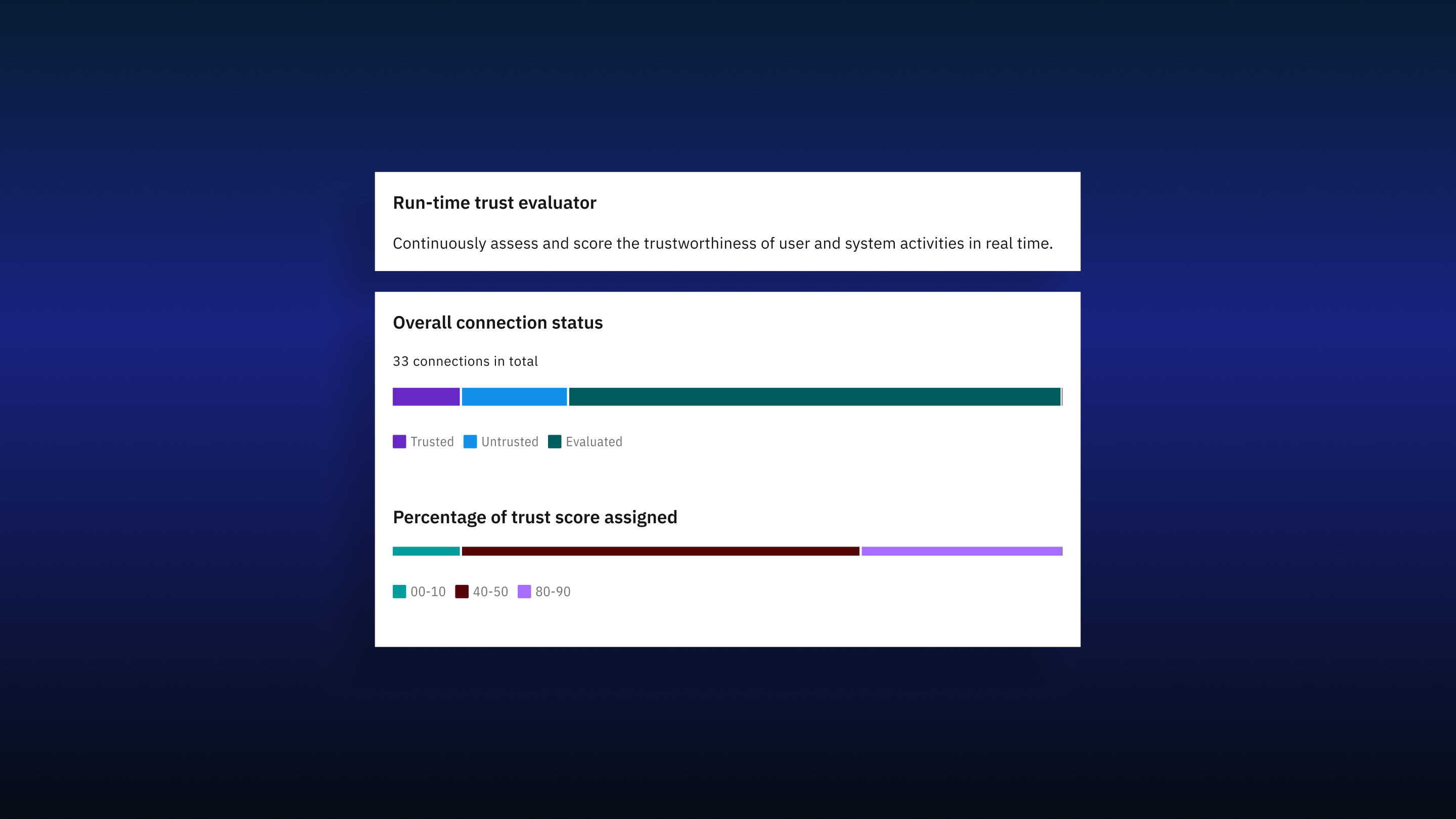
The Run-Time Trust Evaluator exposed model training phases, percentages, and technical ML terminology based on the assumption that users needed transparency into training progress.
Research proved the opposite.
Users:
Instead of building trust, it created cognitive overload.
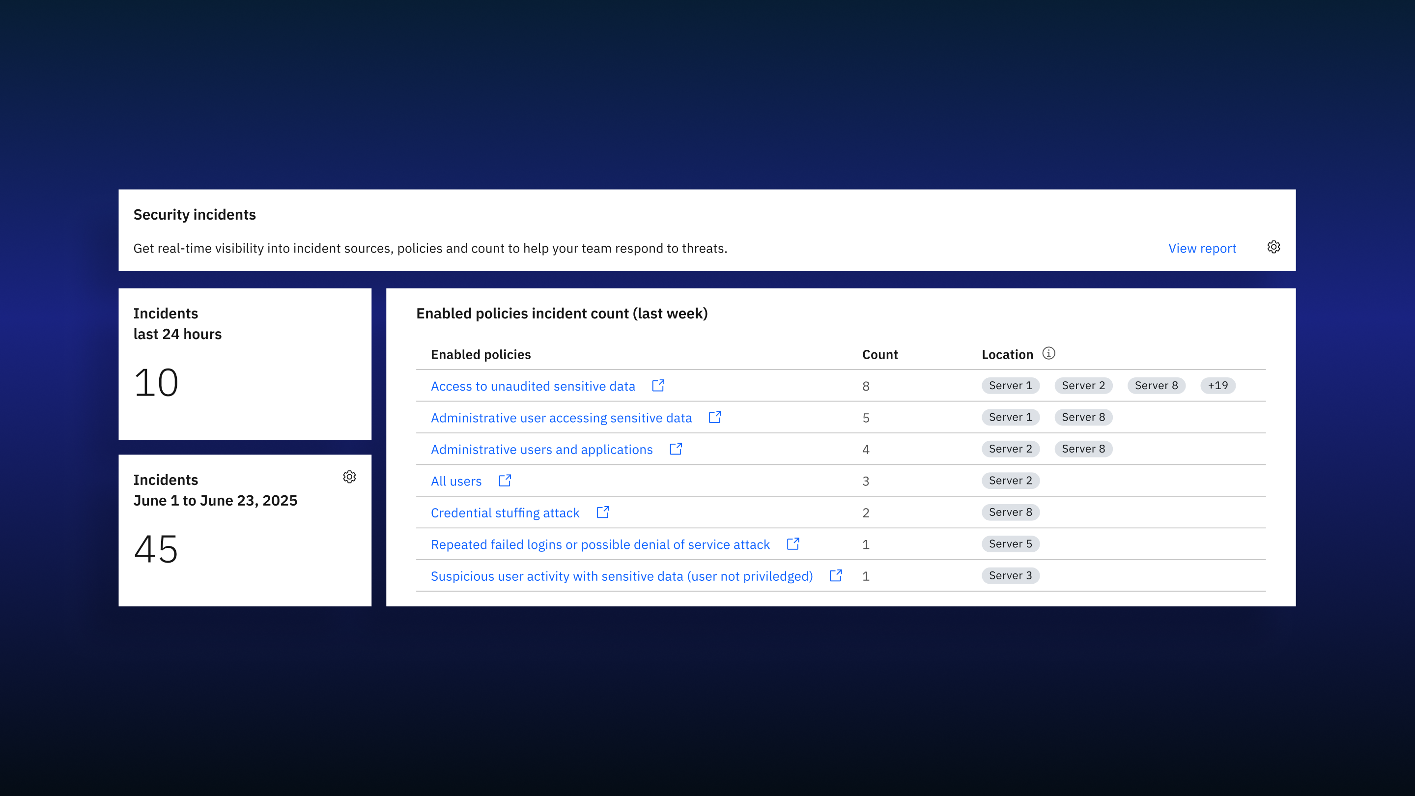
The Security Incidents widget lacked:
Users couldn't quickly determine:
The assumption that existing metrics were "enough" was invalidated.
The Security Anomalies Detector required significant cross-product changes to deliver real value. Given timeline and impact considerations, it was strategically removed from the initial release.
The dashboard wasn't just underused.
It was misaligned with how security teams assess risk and take action.
This redesign focused on four measurable objectives:
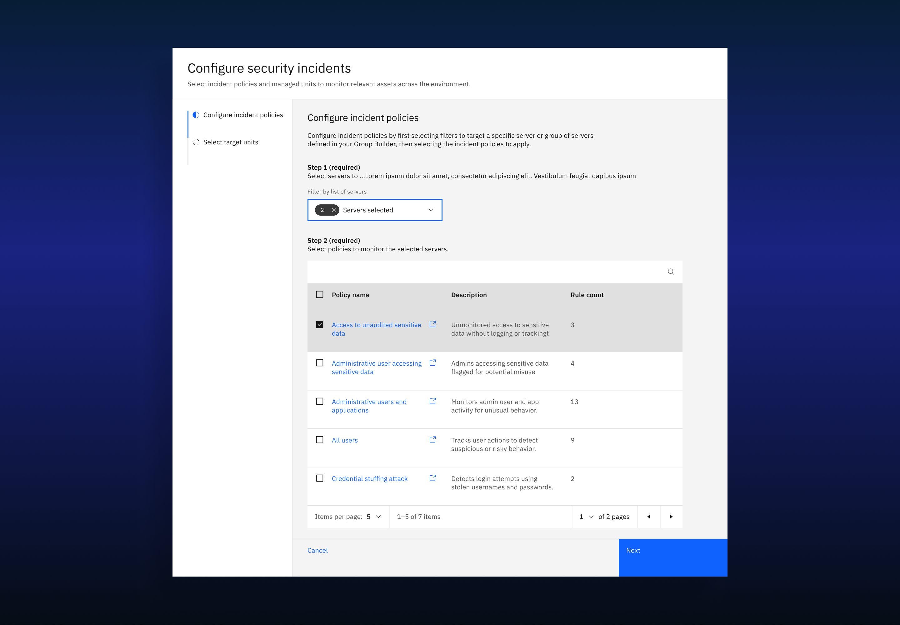
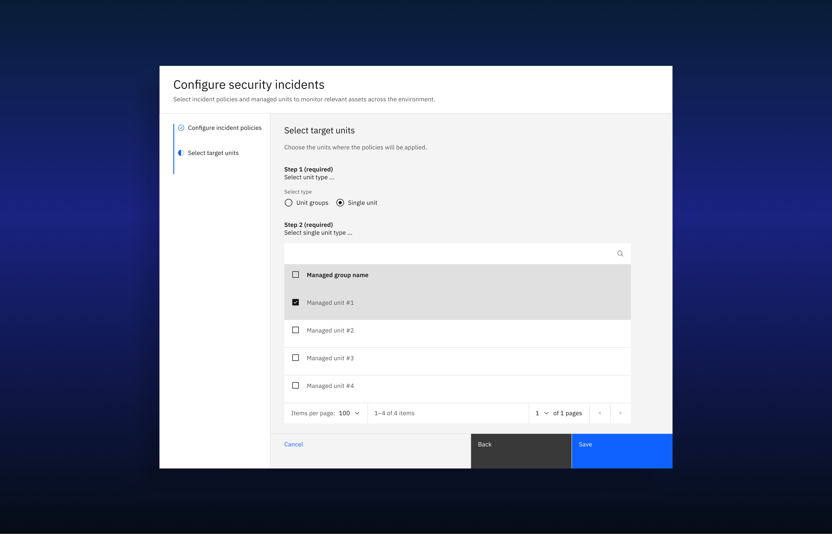
Add a new entry point on the main product dashboard (first screen upon login) and introduce a contextual CTA explaining the dashboard's value.
Replace technical ML training metrics with actionable security indicators and surface high-level counts and distribution summaries.
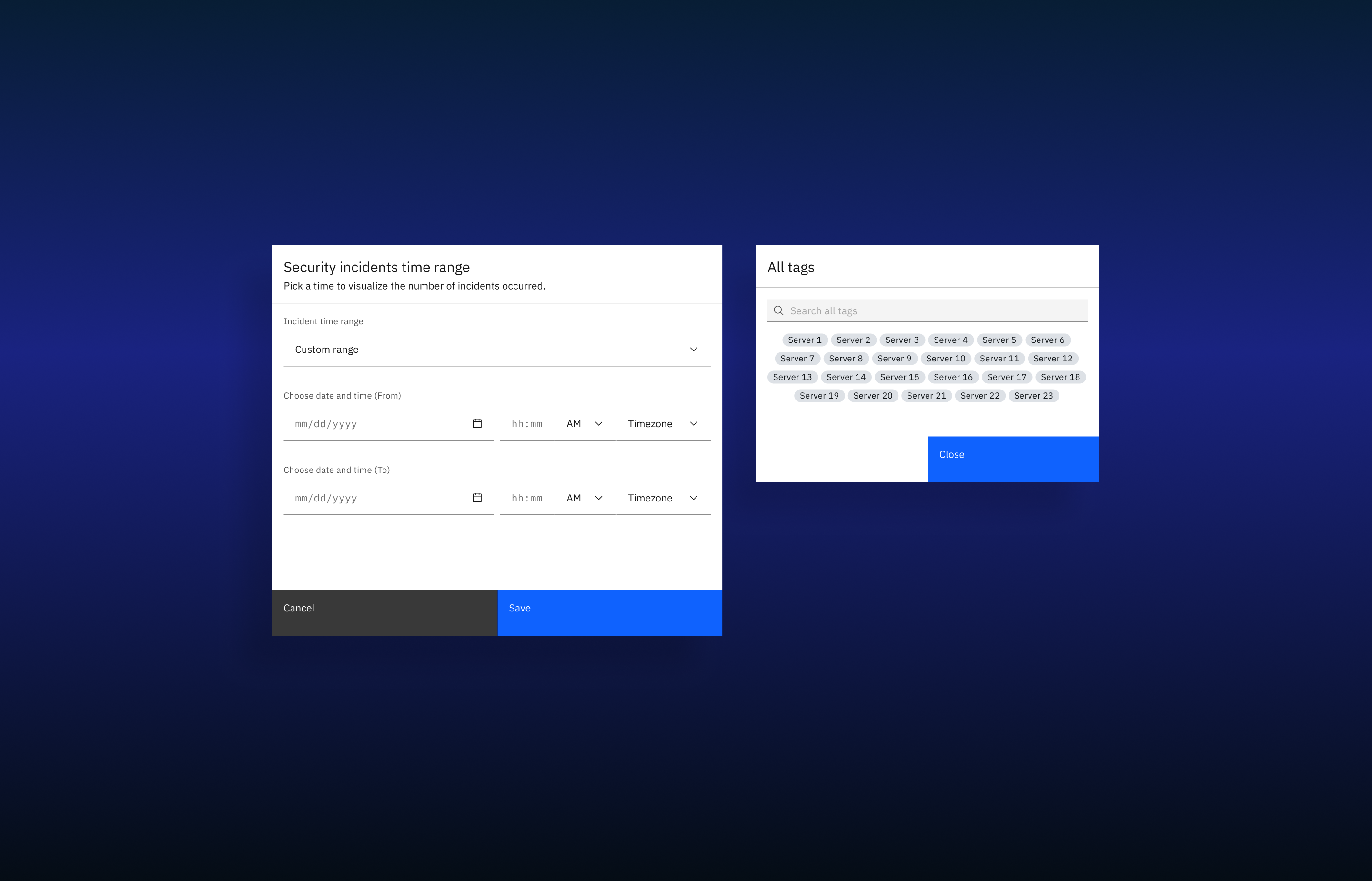
Provide immediate visibility into untrusted connections, incident volume, and policy impact. Allow users to take action externally in their SIEM systems.
Show fewer data points and prioritize metrics that directly influence remediation.
This project required restraint — removing information that created noise, even when it was technically sophisticated.
Challenging assumptions to surface value
Faced with 92% underutilization, we resisted the urge to simply add more data. Instead, we launched a research-led validation process to understand why the existing technical metrics weren't translating into user value.
Conducted interviews with 3 enterprise customers and 2 SMEs to validate discovery findings and map real-world security workflows.
The core issue wasn't a lack of data — it was unmanageable complexity. Users needed faster recognition of risk, not granular visibility into model training.
We assumed exposing training phases built trust. Reality: Users found technical ML terminology confusing and irrelevant to their immediate remediation tasks.
We assumed technical counts were enough. Reality: Users couldn't answer basic posture questions without historical context and policy-level aggregation.
We assumed the dashboard was easy to find. Reality: 92% lower engagement was due to buried navigation and a lack of contextual entry points.
The core insight: Users didn't want to monitor the machine learning model.
They wanted to manage security risk.
Rather than asking "What more can we show?", we asked: "What is the minimal set of signals required for immediate action?" This pivot guided five rounds of focused iteration.
We eliminated the technical "model training" metrics that confused users.
By removing irrelevant training data, the widget became simpler and contextually useful.
Early concepts like "Criticality measures" and "Incident response trends" were blocked by technical constraints and data availability.
By prioritizing feasible, high-value signals, we delivered a reliable overview of the current threat landscape.
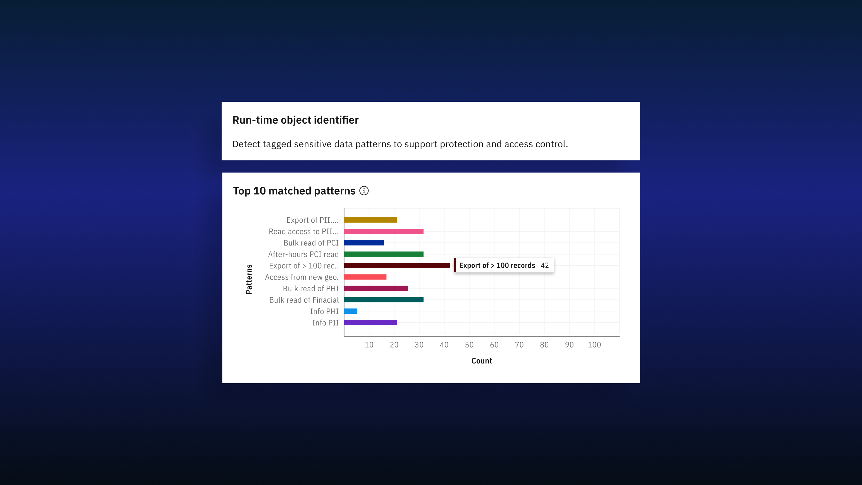
Unlike RTTE, the Sensitive Object Identifier wasn't broken, but it lacked curation. It surfaced raw pattern matches without prioritization.
Research showed users were overwhelmed by pattern counts and didn't know which "sensitive objects" to prioritize for investigation.
The goal wasn't simplification — it was intelligent prioritization.
The Anomalies Detector was strategically removed from the initial release due to cross-product technical constraints, protecting the integrity of the core redesign.
We added a high-visibility entry point and contextual CTAs on the main product dashboard, transforming it from a "hidden utility" to a visible intelligence surface.
The core design principle became: Remove complexity that doesn't drive action. Elevate signals that do.
The final dashboard shows less than the original version, but answers the right questions:
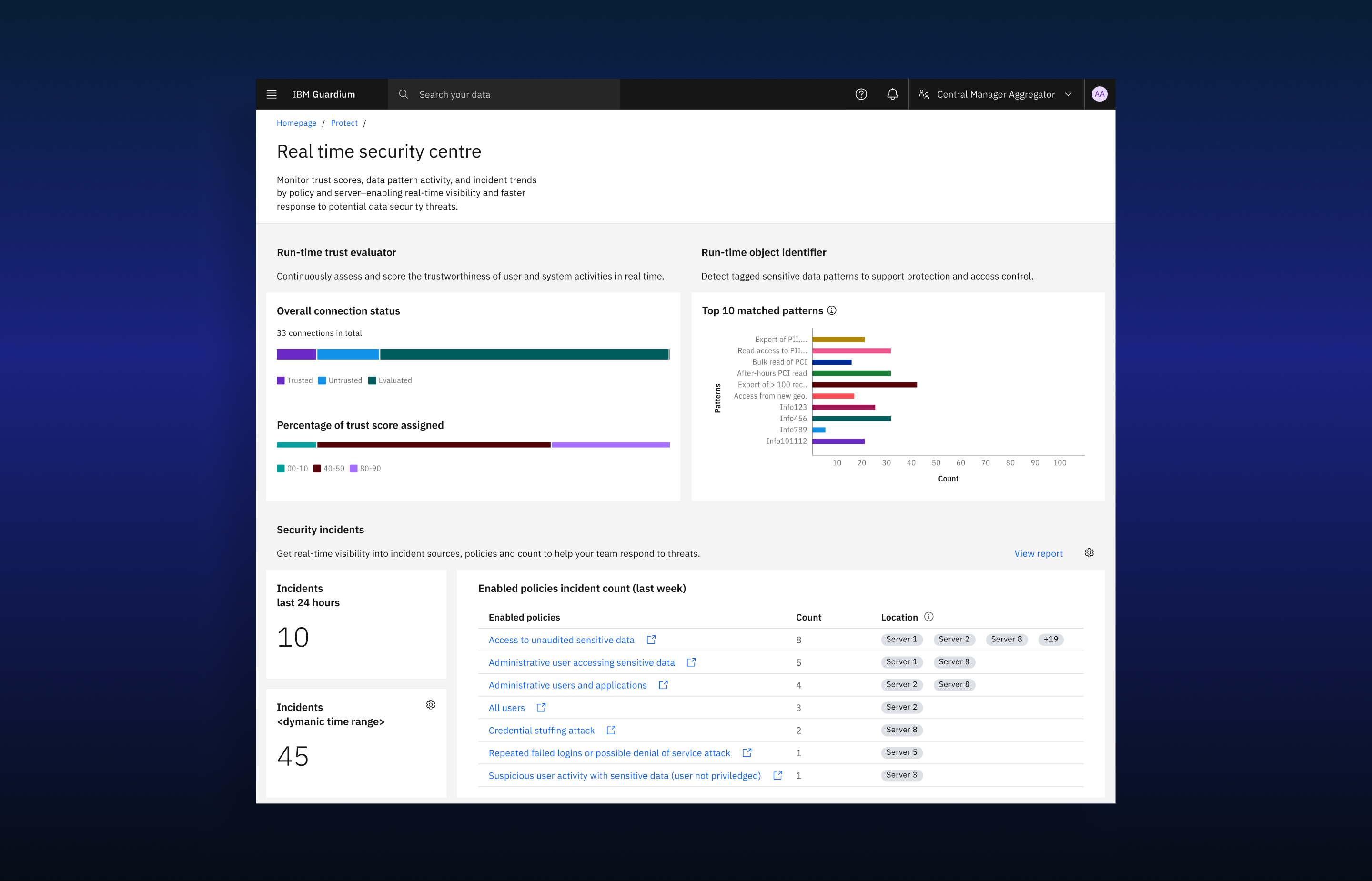
Users could immediately identify:
This redesign transformed the dashboard from a technical artifact into a decision-support tool
Exposing model training details did not build trust — it created confusion. Users don't need ML transparency; they need clear risk signals.
A feature cannot deliver value if users don’t know it exists. Elevating the dashboard to the main entry point was as important as redesigning its content.
Security teams operate under pressure. High-level counts, distribution summaries, and trend visibility enable faster decisions than deeply technical metrics.
Scoping out the Security Anomalies Detector ensured we delivered meaningful improvements instead of shipping a partially valuable experience.
While telemetry initially showed 92% underutilization, accurately measuring post-release adoption proved challenging. We discovered that many GDP customers:
This behavior makes real-time adoption measurement difficult, as a significant portion of the user base may not yet be on the redesigned experience.
"In B2B environments, product success is influenced not only by design quality — but by release cycles, upgrade behavior, and operational risk tolerance."